

problem.
The main pains of Pronovias users were related to usability, causing them to spend unnecessary time to find their dress and, therefore, affecting conversion.
- Searching was not effective. They usually had to browse through hundreds of dresses that did not fit their tastes until they found what they really wanted.
- They went to the shop without an appointment and could not be attended to.
solution.
Redesign of the website of Pronovias with special focus on
- To achieve a navigation that would allow to inspire and locate dresses in different clusters.
- Give users the possibility to schedule an appointment in the shop, trying to be the main focus.
- Understand the industry and not focus on pure e-commerce, as the majority of sales occur in-store.
- Digitalise the in-store experience as much as possible.
process.
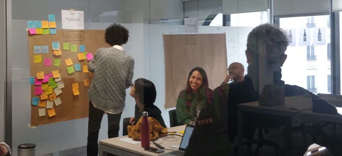

1. Continuous iteration with users
The contact with the users was constant and iterative during the whole process, through interviews and user tests. Their feedback led us to make most of the decisions that can be seen in the final result. Lean methodology and Design Thinking were applied.
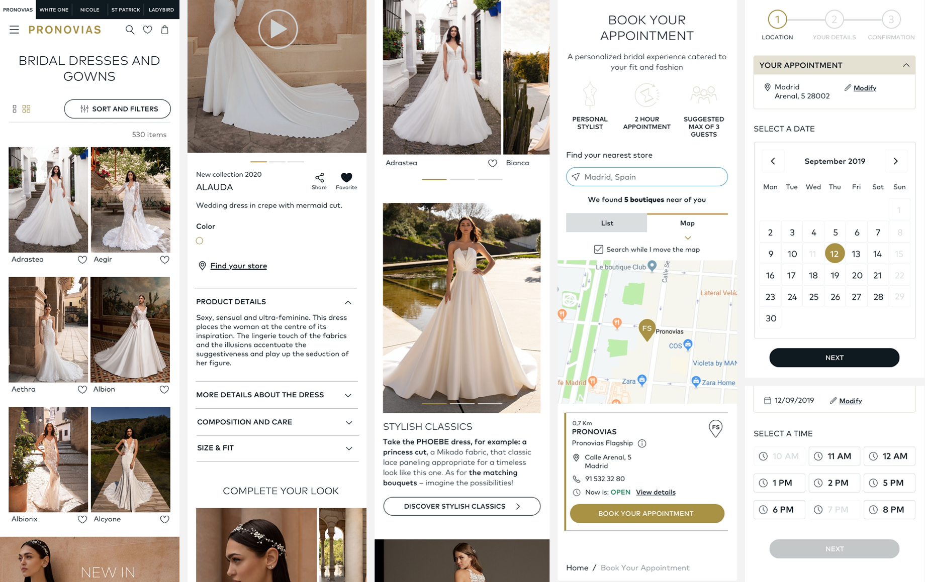
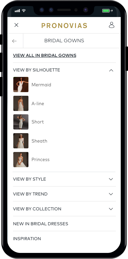
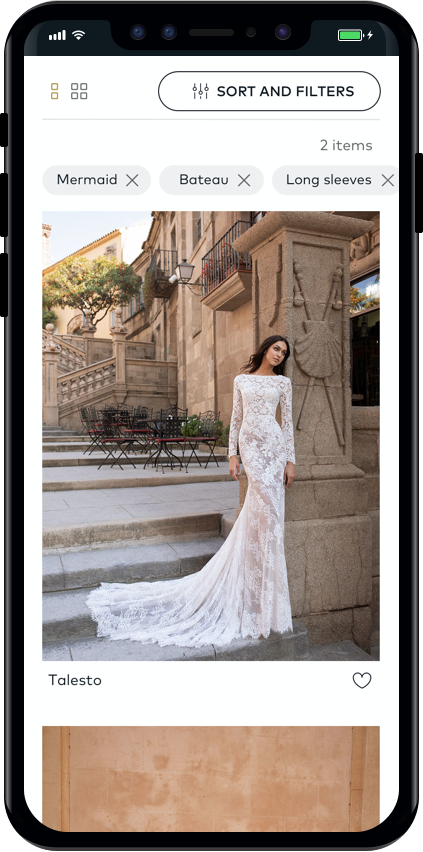
2. UX: Importance of architecture information and navigation
We defined different navigation focusesa visual menu, highlighted sections on the homepage and a very powerful search engine. At the same time, filters became very important, as users know what they are looking for, or at least they are clear about what they are not looking for. And, at a lower level, the product detail page had to correctly explain all that was implicit in each dress.
3. Building a design system
We started with a design system with the aim of creating a common language, correctly expressing the identity and values of the brand, as well as speeding up design and development times when carrying out possible updates.
4. Outstanding action: Make an appointment
One of the challenges was to achieve a notable impact on the appointment request, so we chose for the action to accompany the user throughout the website in a natural way. We looked for the simplest and most usable process possible for users on the front end, and at the same time, the most useful for the shop and the business on the back end.
5. Visual design
As for the visual identity, we followed an editorial style, with special care and emphasis on the treatment of images. After all, one of the objectives of the website was to inspire users.
impact.
Overall data is confidential but:
- Bounce and abandonment rates were reduced.
- Increased use of filters.
- Improved appointment conversion.