

problem.
Direct online sales of cruises were very low. Besides the intrinsic nature of buying cruises physically because of the financial reimbursement involved and the type of users targeted, the hypothesis was that the product detail page was not usable.
solution.
Redesign the product detail page taking into account the new brand and be able to show each itinerary with its possible variables, as well as a grid of dates and prices.
The aim was to show users all the options giving them the possibility to compare and provide maximum information.
process.

1. Understanding needs and empathising with customers
En primer lugar, se identificaron las necesidades de los usuarios. ¿Qué información les interesaba? ¿Qué les condicionaría para realizar o no una reserva? ¿Cuál era el objetivo real de este vertical teniendo en cuenta las necesidades del usuario?
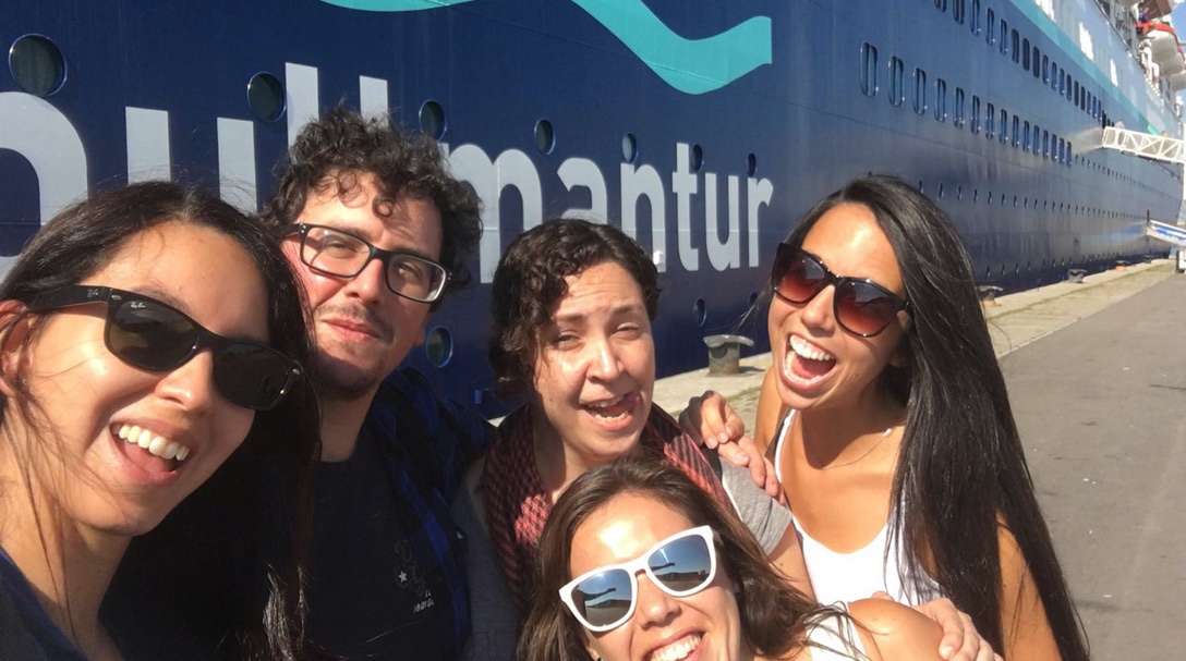
La mejor forma de resolver estas cuestiones era conocer la experiencia en primera persona. Nos fuimos a un crucero para hablar tanto con las personas como con la tripulación.
2. Knowing the competitors and defining the product
Most of the design decisions were based on the qualitative and quantitative data we obtained from our customers and were contrasted with a benchmark.. This helped us understand other points of view and inspired us in defining the product.
We understood that what customers were really looking for in the PDP was to have a complete overview of the product and to be able to compare prices depending on the date and the different itinerary options.
3. Ideation and prototyping
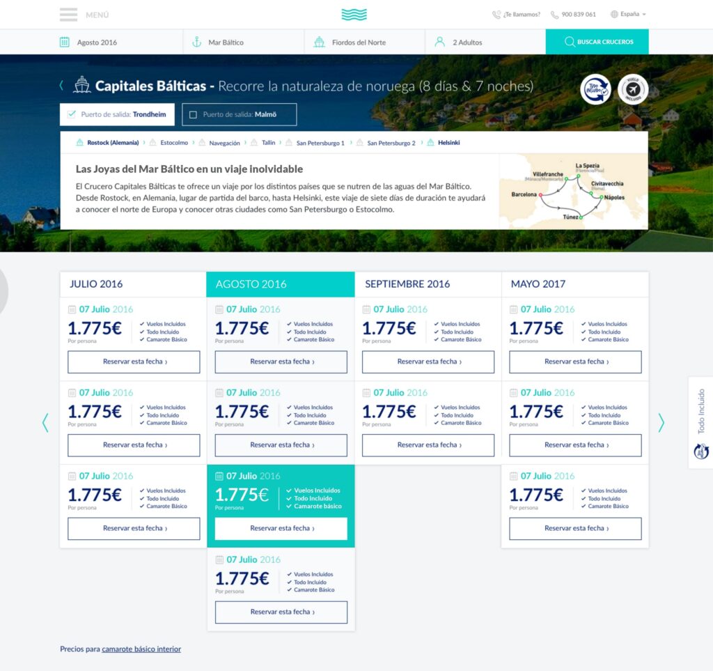
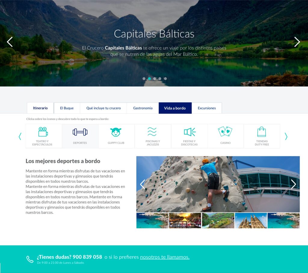
In the first block, brief information about the itinerary was shown with its corresponding map, where the user could select the port of departure. Then, the prices were shown in a visual way so that the user had the option to compare and easily select the date.
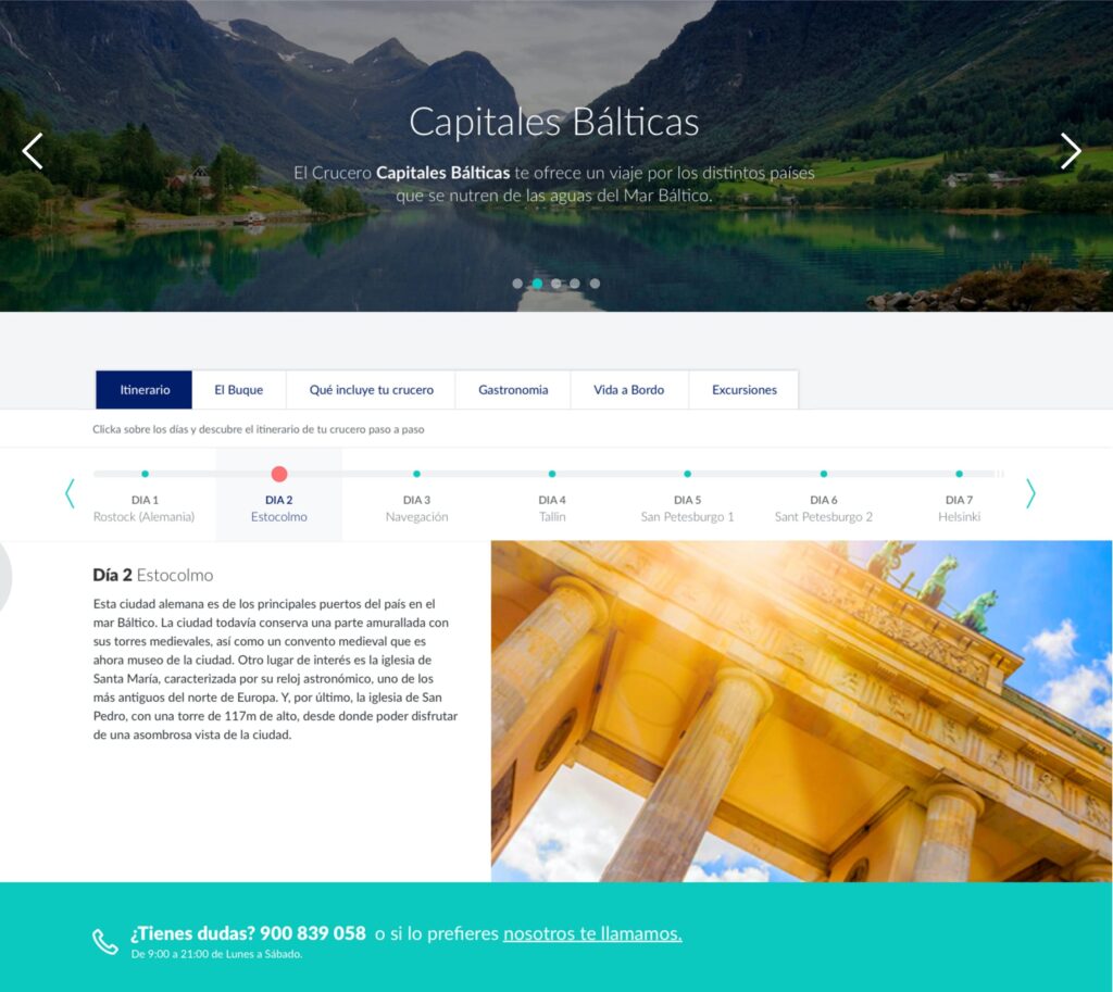
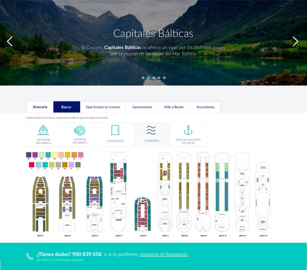
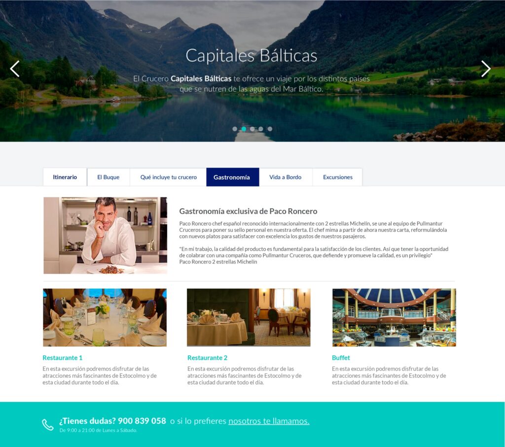
In the second block, the focus was on inspirational content. The idea was to show very powerful images to make the user fall in love and show them all the detailed information about the product: itinerary, ship, what your cruise includes, gastronomy, life on board and excursions. It adjusted the content design of each tab to offer the best possible experience to users. tab para ofrecer la mejor experiencia posible a los usuarios.
The final visual design demanded, due to the implementation of new visual resources, adding new components to the design system.
4. Testing and measurements
Prior to the market launch, prototypes were validated with customers.
Once launched, we implemented measurement processes and a CRO methodology based on continuous optimisation.
impact.
- Responsive redesign (no longer visible in production because Pullmantur went bankrupt with COVID).
- 50% increase in visits in the first 6 months.
- 12% improvement in conversion in the first year.