problem.
From the Innovation and Digital Transformation department of Iberia, we launched end-to-end digital products responding to the most innovative user needs. We didn't want to offer Alexa and Aura experiences just because everyone does it, but to make it really useful for customers and, at the same time, make the call centre more cost-efficient.
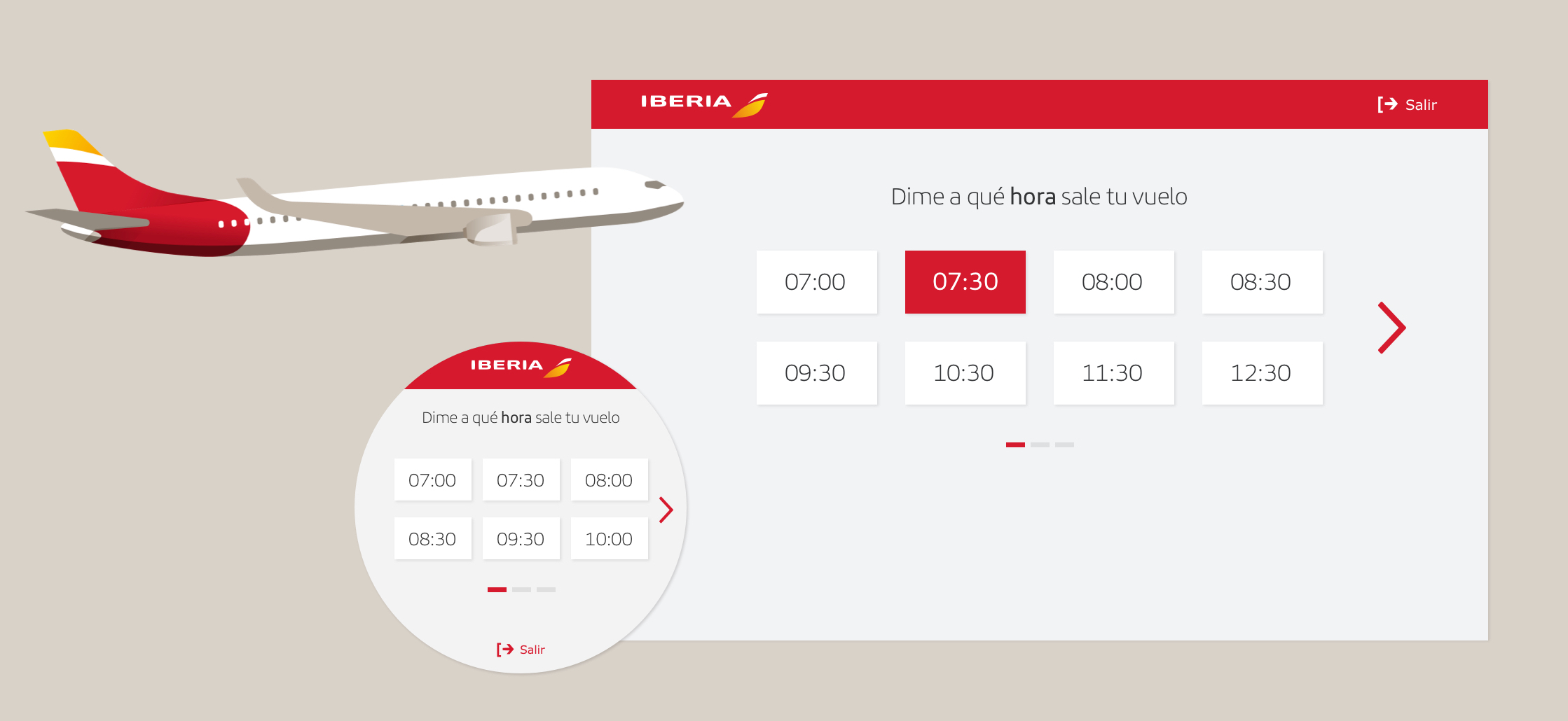
My challenge here was twofold. Conceptual: What flows could we automate; and visual: How could we visually accompany the voice experience?
solution.
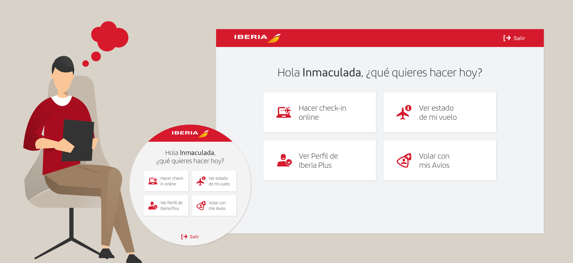
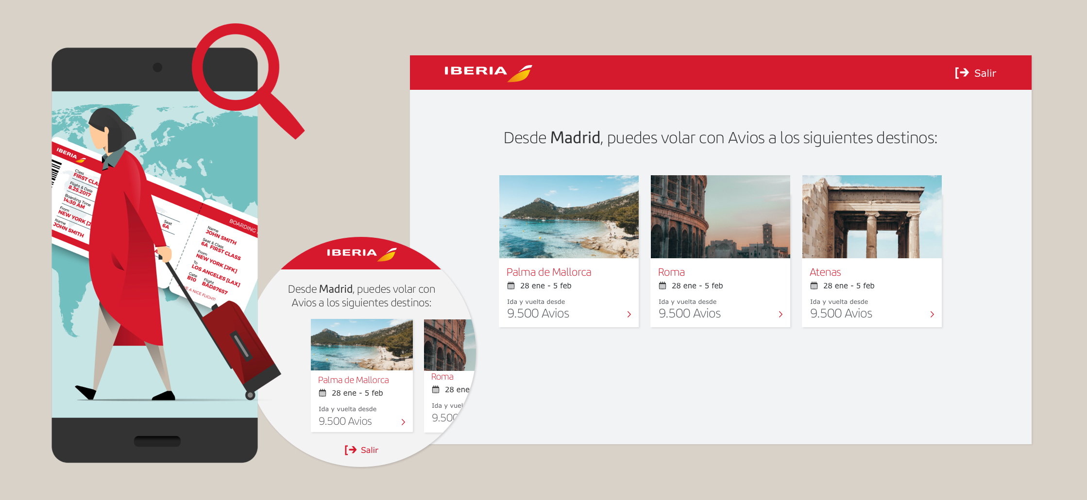
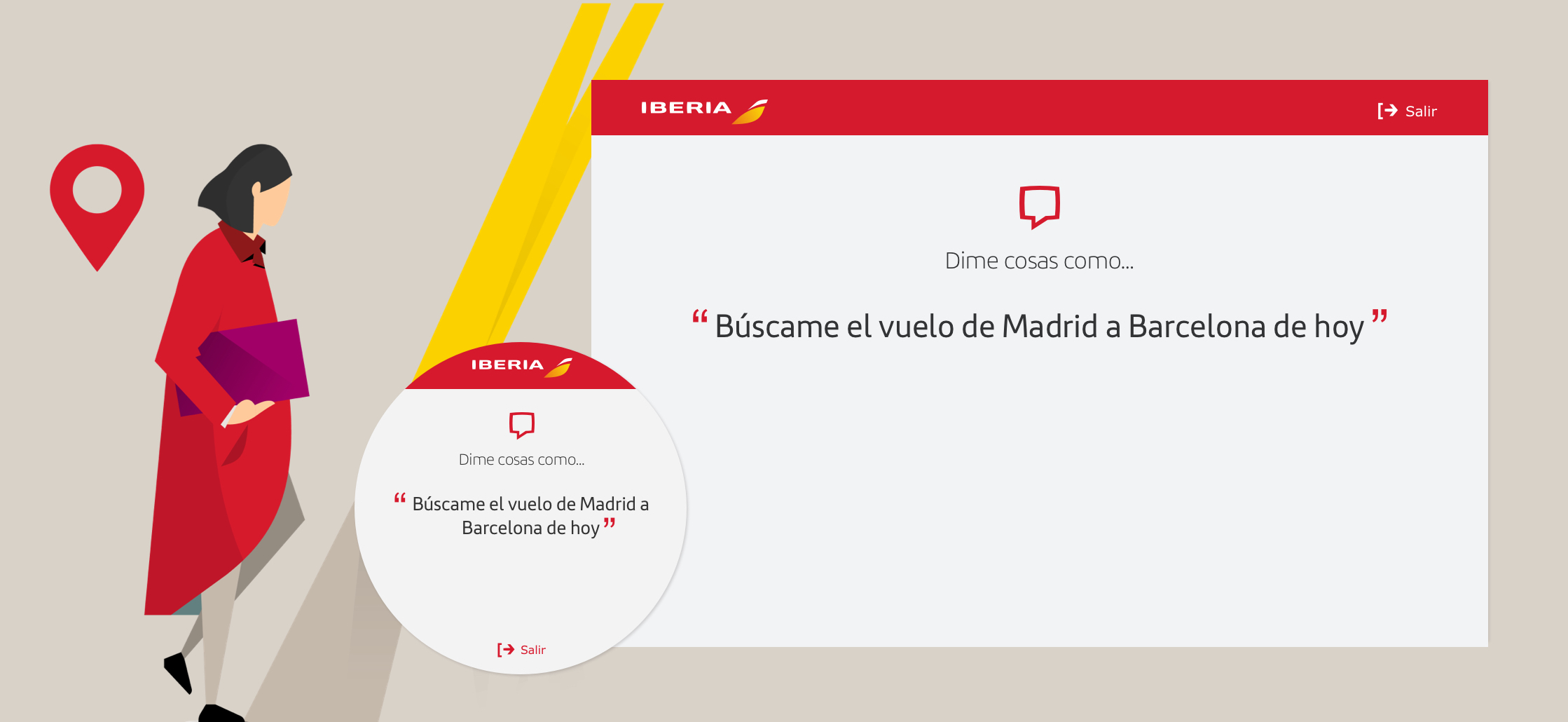
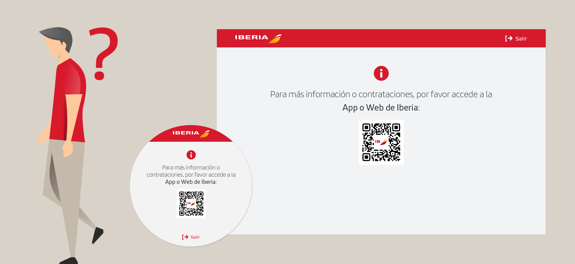
Automate new flows in Alexa and visual design for the screens to accompany the user experience and make the whole process more intuitive.
process.

1. Identifying voice flows and improving usability
Working closely with the customer service & engagement team, we identified which flows could be automated. Some were already there and others we added from scratch to improve usability. The goal was twofold:
- Reduce call centre calls by offering a self-service experience.
- Improve the user experience through an innovative solution.
We decided to implement the feature for Alexa in the flows that caused the highest number of calls:
- Check-in
- See the status of your flight
- Check last-minute info
- Find where you can fly with your Avios
- Listen to audio guides
- View your profile
2. Visual accompaniment
The biggest challenge here was to create a new visual experience for the different screen formats of Alexa, a device we had never designed before.
Since these devices are used in very different ways, I created new components from scratch and made the experience as simple and minimalistic as possible but always consistent with the rest of the devices.
