problem.
Indra's maritime traffic monitoring and control software was totally obsolete. The main problem was related to the usability and robustness of the system, which negatively affected customer satisfaction at the time and the acquisition of new customers. All this together with the perception of the brand.
solution.
My goal was to redesign the entire UX with the user at the centre and to coordinate the project with all stakeholders.
Some of the most challenging requirements we decided to implement were:
- A desktop design intended to extend across multiple screens.
- Interface valid for touch screens.
- Multi-languages.
- Adaptation of the interface to day, evening and night modes.
process.
1. Understanding the needs and requirements of the client
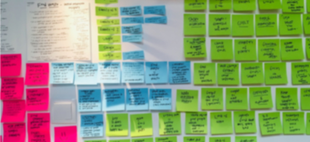
As it is such a complex product, this phase was essential to understand it and define its objectives. We built the backlog, established the scrum work methodology and carried out training on both sides. Design Thinking workshops were held and a co-creation methodology was established.
2. Market research
Direct contact with the customer was necessary to understand the market and to know the main competitors. Being a security product, access to the competition was not easy.
3. User research
Once I understood the scope of the market, I started with user interviews. There were three types of users, whose usage varied by country:
- Civil or Coast Guard
- Maritime engineers
- Hybrid profiles
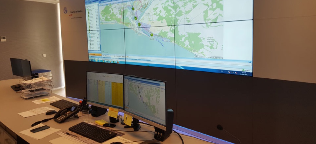
This required several trips to Huelva, a client of the platform in its port and maritime control services.
In addition to the interviews, observation of their workspaces and day-to-day life was key to understanding their needs: how they interacted with the different screens, how they navigated the software, how they combined its use with other tools, and how they interacted verbally with each other.
4. Building flows and user journey
The first visits helped us to understand the different flows and ways of working. The most curious thing was to see how the users of the platform carried out the tasks automatically, by acquired learning. The functionalities that were at the first level were hardly used and to carry out basic tasks they had to do a lot of clicks. It was defined that the maximum number of clicks to perform a task was 3, always leaving the most common tasks within 1 click.
5. Definition of the information architecture
The architecture was built hand in hand with the client and the users by means of card sorting. Without a doubt, the most complex part was to completely forget the initial architecture and define a new one from scratch.
6. Prototipado e interacción
Once the different phases were defined, I started to build the wireframes and the interactions in continuous validation with users and clients.
In the header, it was possible to see the status of the system: time, status of the different elements, notifications and alerts. In addition, there were filters and access to the profile.
The biggest challenge was to change the navigation. In the previous version, the different actions were accessed through a top menu (the classic menu with File, Edit, View, etc.). On the main screen, the elements were displayed but could not be interacted with. Thinking about usability and compatibility with touch screens and according to the law of proximity, I focused the actions on the elements themselves. That is, clicking on a ship, radar, camera, etc. would show their allowed actions.
The menu was moved to the bottom, reserved for generic actions (without interaction with the previous elements on the screen) and showing the most common actions in the first level. I decided to make it collapsible so as not to lose the visibility of the main page.
7. Follow-up with UI and development
Finally, I conducted all the follow-up with visual design and development. Given the scope and complexity of the project, I carried out a significant documentation process.
impact.
- We made a radical change to the interface. We were able to simplify actions and make it easier for users to work.
- We succeed in positioning the brand and adding value.
- We increased product sales conversion.
- Aumentamos la conversión de venta del producto.
- The project even appeared in some media. See news here.

