problem.
Customers are generally stressed when going to the airport. Among the causes of stress is everything related to documentation and tickets. Most passengers generally carry everything digital and printed (just in case). It is necessary to show documentation and/or ticket at different points, mainly check-in, security access, police control and boarding gate.
How can we make the experience seamless and reduce the stress of finding and having to show documentation and tickets?
solution.
Biometrics is now a fact at Madrid airport. We designed a new facial recognition boarding feature to offer a consistent customer experience, both digital (web, app and kiosks) and physical (inside the airport).
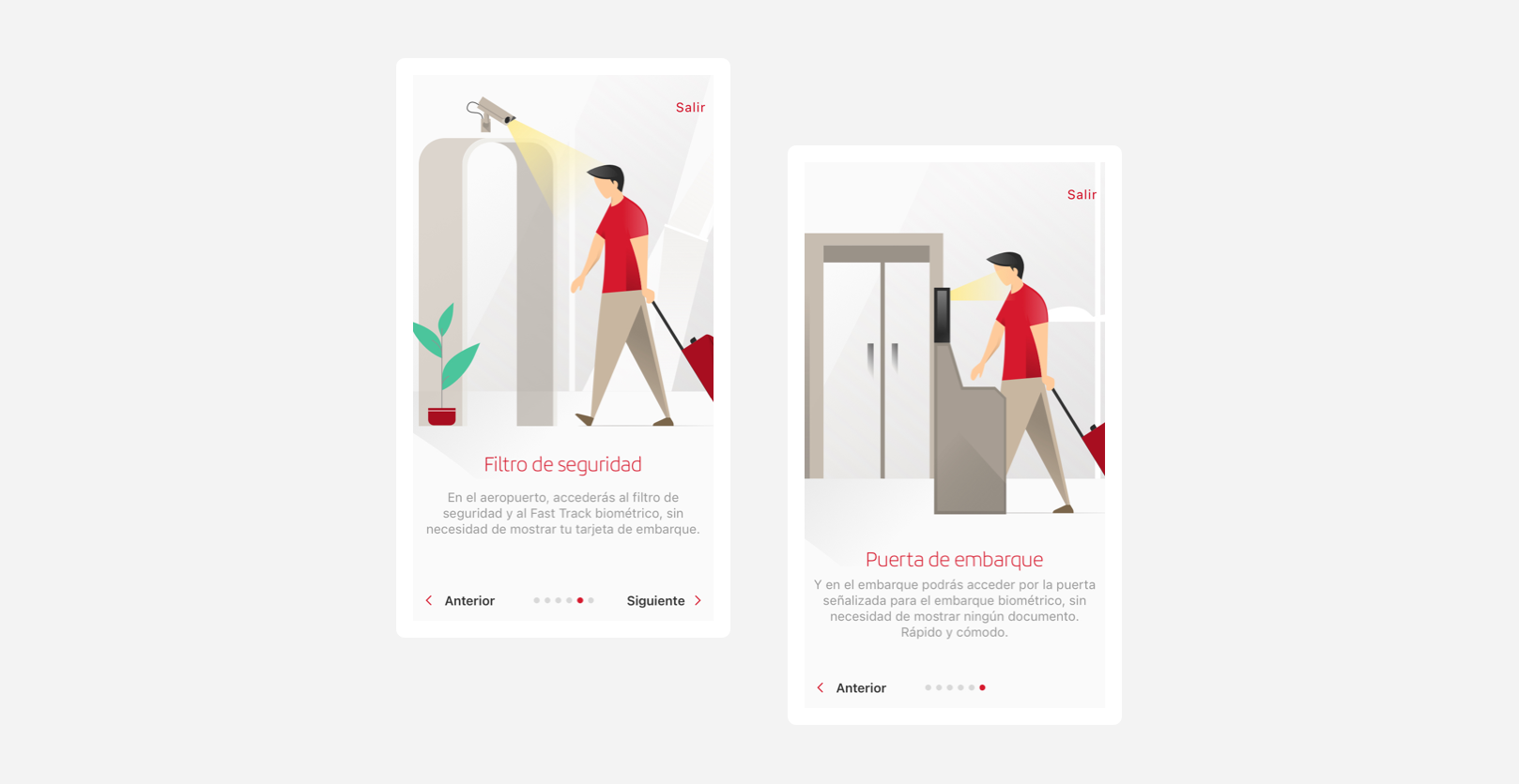
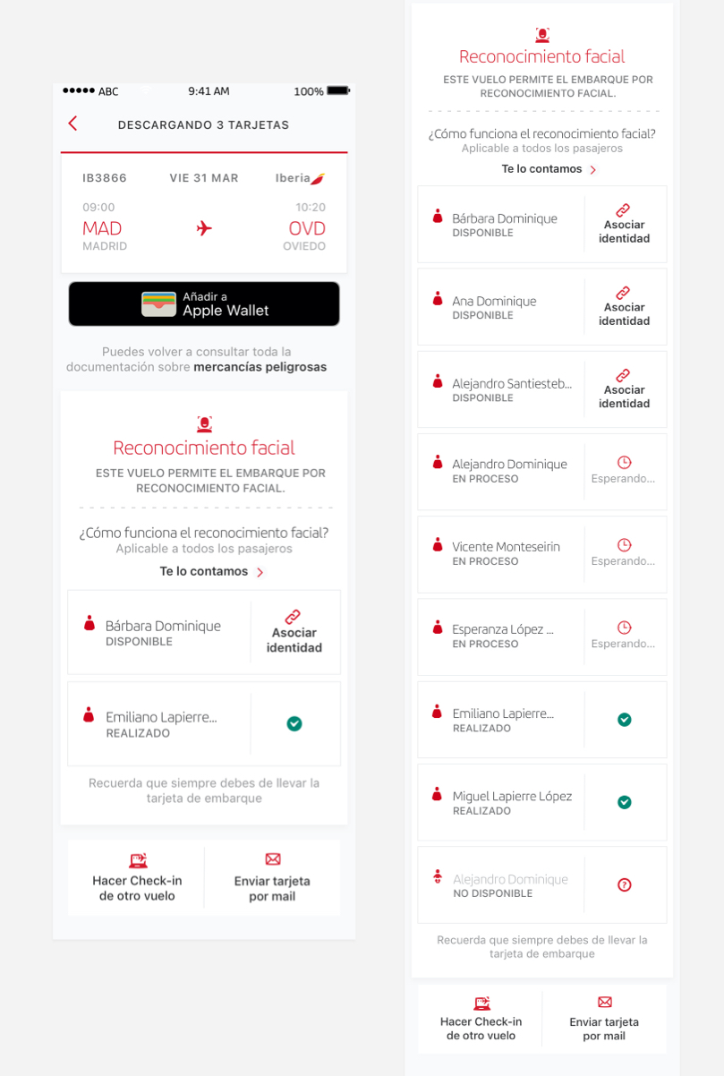
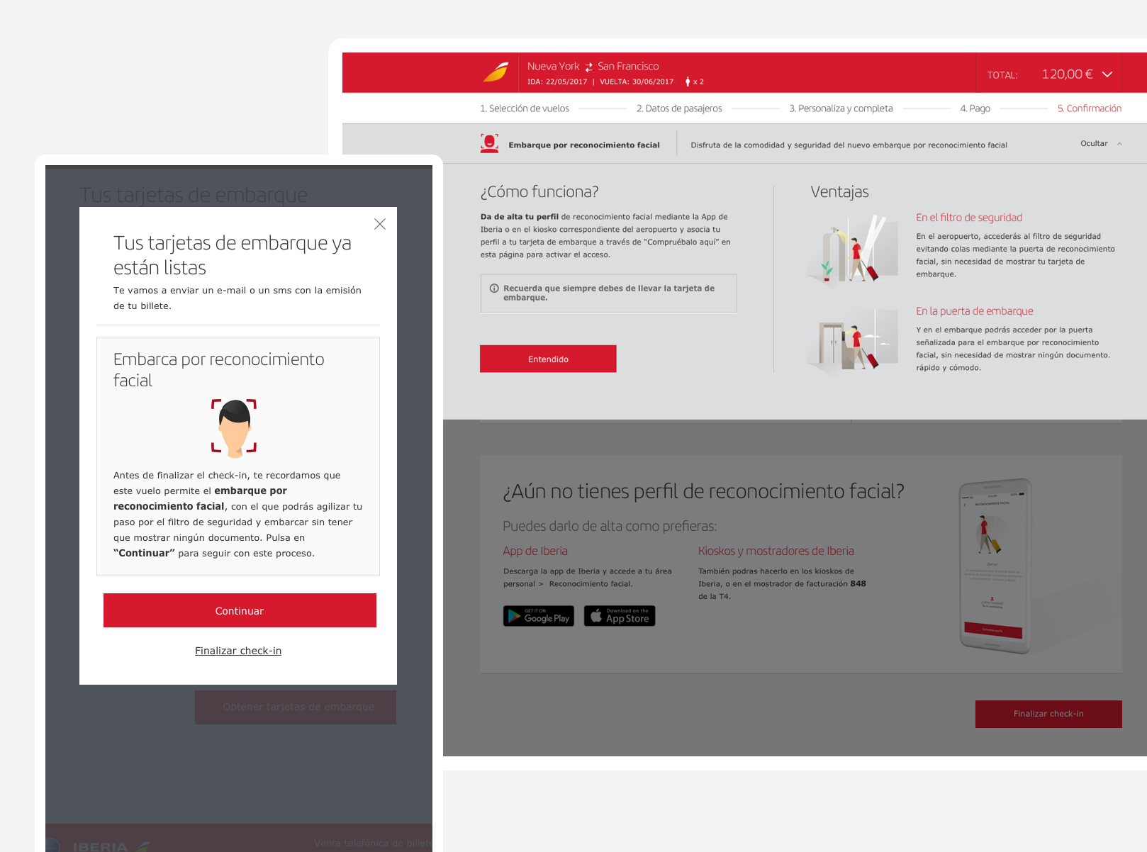
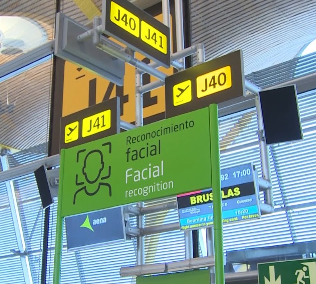
Embark by facial recognition allows customers to access the security filter and the boarding door, without showing any document or ticket. To do so, they must register in the system from the app or airport kiosks and associate their facial recognition profile with the boarding pass.
process.
1. Launching the MVP
The most important considerations for launching the MVP were:
- Flow understanding. The flows definition of this product was very complex. The experience depends not only on Iberia but also on Aena, which is responsible for data processing.
- Legal support. Data processing is one of the strong points of the project and required working hand in hand with the legal department. The aim was to provide absolute transparency to users.
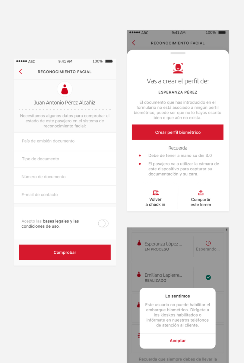
- UX writing. Given the complexity of the flow and the newness of the product, the definition of clear messages was the key.
- Basic features definition. The MVP was launched for individual bookings only and the user could access the flow from check-in.
2. Continuous iteration
Since we had only launched two routes with this type of boarding available, we did not have much traffic, so we have little quantitative data. Therefore, regular visits to the airport are essential to detect inefficiencies and areas for improvement.
Through the Scrum and Design thinking methodology, we continued to work on the different phases of the product and iteration with users was continuous.
3. Product development
With the MVP already launched and all the learnings from the qualitative research, the product has been extended with the following features:
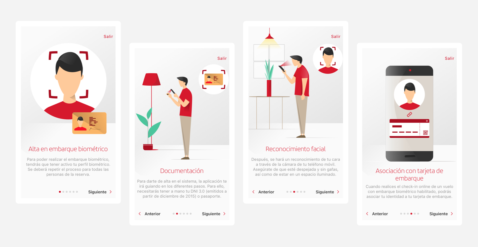
- Onboarding improvement. The release of such an innovative and recent product on the market requires detailed onboarding so that all users understand it. This process has been improved both in the app and on the website, with the inclusion of illustrated steps.
- Possibility to sign up from the profile. Apart from the check-in, the user can sign up from the app profile
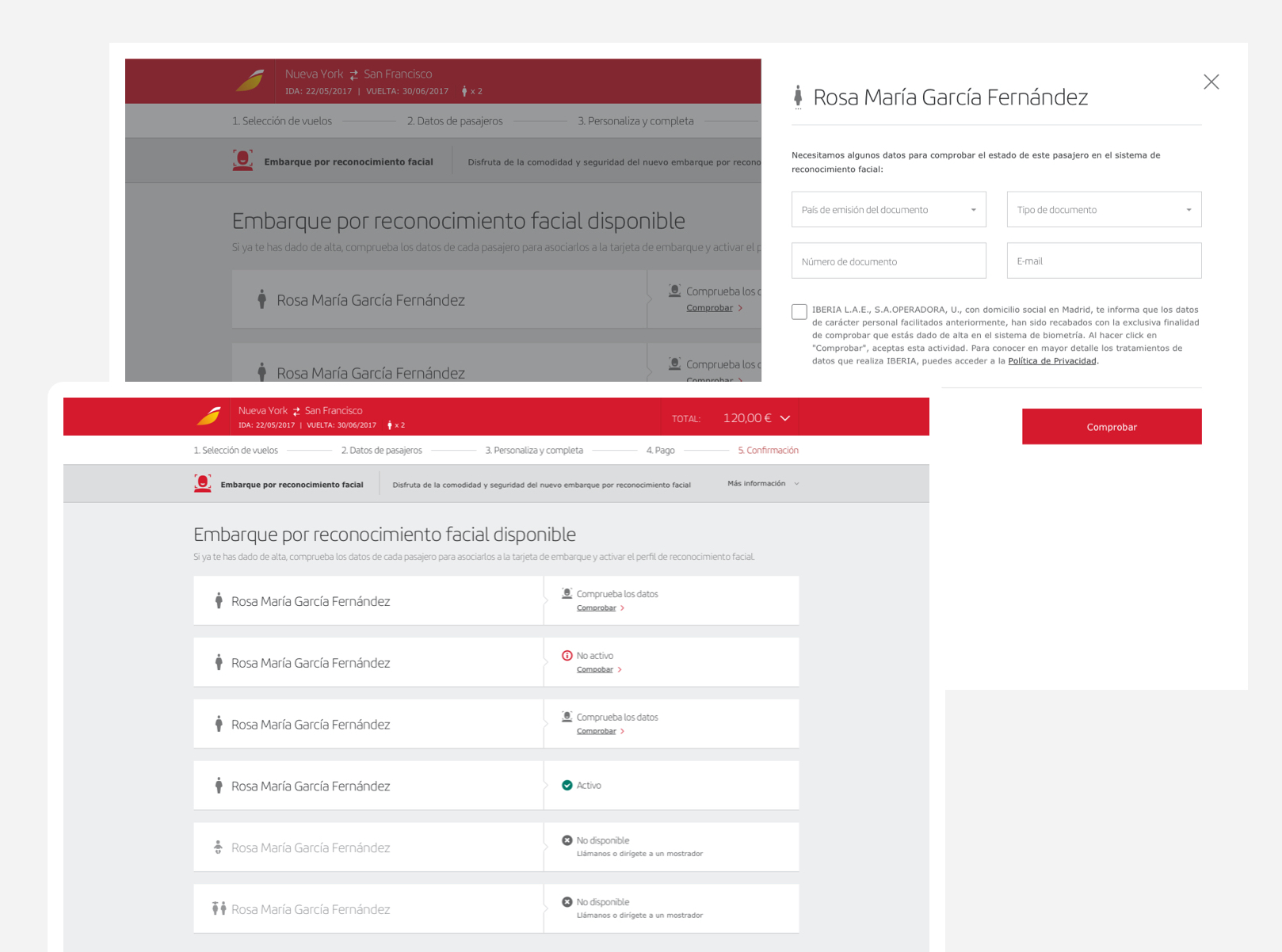
- Multi-passenger experience. The experience has also been extended to group bookings. The same device can be used to register and associate the boarding pass with all the people in the booking.
- Automatic association. When the user registers in the system, the boarding pass is automatically associated to the next flights.
- Definition of error types. We have moved from the generic error to the detail of the different types of errors in order to facilitate solutions for users.
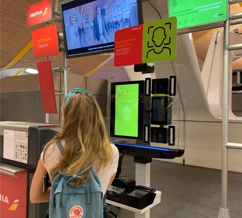
In addition, I also worked on improving the physical experience, both operational and for customers, with the proper arrangement of kiosks at the airport.
impact.
- Implementation on 4 routes.
- More than 1,000 registrations from the app in the pilot MVP.
- Adoption of 10%.
- Media coverage. Link to the news here.
