problem.
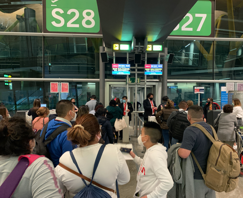
The COVID crisis changed the way people travelled. Very few countries did not require entry documentation (tests, vaccination certificates, health declarations, etc.). This caused a lot of uncertainty for passengers and long queues at airports, negatively affecting the customer experience and causing operational problems at the airport, usually leading to delays.
In this context, we asked ourselves how we could improve our customers' experience and reduce their uncertainty while avoiding operational problems.
.
solution.
Creation of a new digital product consisting of 3 main areas:
- Public landing where passengers could find out all the information required for their destination. Or also choose the destination based on the required documentation.
- Your Documents section in the profile and booking management where users could upload their documents and check their status until they were verified, allowing them to go to the airport with complete peace of mind and avoid queues.
- Backoffice tool powered by OCRs where the backoffice team managed the requests and provided customer support if necessary.
.
process.


1. Understanding of customer needs, regulations and airport issues
Passengers were unclear about what documentation they needed to travel and arrived at the airport with a lot of anticipation and uncertainty. On most flights, some passengers were grounded because of this problem; for example, their vaccination certificate was not valid for the country they were travelling to or they were carrying an antigen test and their destination required a PCR.
At the same time, airport agents had to change the whole process. Previously, they only asked for a passport and boarding pass. Now they had to check all the required health documentation to allow passengers to board. This resulted in huge queues, flight delays and even fines if a passenger was allowed to board without any of the required proof.
2. Building a user-centric product
Once the problem was understood, the objective was to find a solution to resolve the uncertainty. And so "Tus Documentos", Iberia's new document verification platform, was launched.
Users can upload their documents 72 hours before their trip and receive verification before going to the airport. This product connects to a landing page where the documentation required by the different destinations can be consulted at any time and regulatory changes can be viewed in real-time.
As for the customer journey, we tried to simplify it as much as possible. The customer receives a personalised e-mail two days before their flight, informing them of the documentation required by their destination and giving them access to the form to upload it in three simple steps. The back office team reviews the documentation and, within a few hours, the client receives the OK to travel. They arrive at the airport and their boarding pass has already collected the information, so they can access the airport without having to show anything, avoiding long queues and delays.
The defined success metrics also had this dual objective: to reduce customer uncertainty and frustration and to save operational costs. The goals were:
- Achieve a 50% adoption rate.
- Reduce all operational costs associated with this problem with 0 delayed flights and 0 fines.
3. From MVP to consolidated product
The first MVP we launched was no-code: a simple form where users entered their data and documents and agents validated them manually. This allowed us to launch quickly and validate the product, contributing to the first goal of user adoption and activation.
We increased the activation and soon saw the impact on delays and fines. However, operational costs were not fully reduced because agents needed to validate the documentation. It was necessary to implement OCRs and automation to reduce operational costs and return to pre-COVID levels.
4. Alignment of all areas involved and GTM
One of the biggest challenges was to align all the departments involved in this product: transformation, customer, digital, airports, operations, marketing, etc. in order to achieve an optimised and unified user experience.
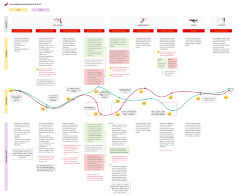
I developed an extensive blueprint detailing all the touchpoints of the different users involved: customers, back office team and airport agents; considering all possible scenarios.
In addition, the implementation of scrum as a working methodology was necessary to keep coordination.
5. Data-driven to improve and scale the product
Taking into account from the beginning feedback from customers and airport agentsas well as behavioural and navigation data on the digital product, was essential for its evolution: interviews, feedback widget on the form, surveys, regular visits to the airport, measurement of the funnel, heat maps, recording sessions, etc.
The main strategies that helped us evolve the digital experience were the following:
- Analysing user behaviour through Amplitude. Mainly measuring the conversion funnel and user retention, as well as variations between different routes and segments of people. This allowed us to formulate hypotheses, which we validated through:
- Interviews
- Usability tests
- A/B testing
- Two days after the trip, we would send out a customer survey to gather more feedback and measure the NPS.
- Through QXscore, we measured UX on a quarterly basis.
With all the data, I identified new pains and prioritised the roadmap with opportunities for improvement.
impact.
- More than 50% adoption.
- Improved NPS.
- 0 delayed flights.
- 0 fines.
- Return to pre-COVID operating costs.
- Computing 2022 Best User Experience Award


